Thursday, November 30, 2006

Magazine: Profile of Three Black Designers

The percentage of practicing designers of color is so small that it is generally accepted that they do not exist. In my on going efforts to impact this fact I have been working to get the word out that we do indeed exist and we are super-talented.

The link below looks at three professional designers who happen to be African-American.


POH Article Summary

Wednesday, November 29, 2006

Class Project: Toilet Paper Dispenser

A great project for a introductory design class would be to have the students consider ways of improving the toilet paper holder.

I believe this would work well as an student project because the toilet roll is so much a part of our day-to-day lives that it is often unnoticed. So in asking students to rethink this object and address the opportunities within the context of today would no doubt yield some interesting results.

Exhibition: Liquid Stone: New Architecture in Concrete

This past year I was so impressed by the presentation on concrete at the National Building Musuem (DC) that I am now a devotee of the substance. Not only was the content well organized but the exhibtion space and graphics were all done well.

Online Summary

Virtual Tour of the Exhibition

Tuesday, November 28, 2006

The Problem with Mobile Phones

The mobile phone is now the proverbial third screen following the the TV and computer screens. But how is design for mobile devices different other than its smaller size? How is the experience for the user uniquely different?

Fortune Article

Business Week Article

Monday, November 27, 2006

Fashion Design: Using Technology to Improve Womens Undergarments

In addressing the functional needs of women's undergarments (i.e. comfort, apperance, fit...) through new materials and manufacturing techinques has resulted in a noticeable bump in sales among brands producing these products.
Why has it taken so long for design to tackle the issues around women's supportive garments? Has the absence of women designers produced a lag in innovation in this segment of the clothing industry?

Chicago Tribune Article

In a simuliar vain, why do the WNBA uniforms appear to be no more than the same jerseys and shorts that men wear? There is an opportunity here to better serve the female athlete with flattering clothing designed with her and the viewing public in mind.

Story Behind WNBA Uniforms

Design's Future: What's Next?

The Industrial age was largely defined by the ability to mass produce items that eased the chores of daily life and expanded our view of the world through access to multiple forms of transportation. The internal combustion engine provided the opportunity for the automobile to become the iconic product of the analog (atoms) age. During the 20th century the car has shaped lives in enumerable ways, and continues to morph into new forms and into new communities without a hint of fading away.

Likewise, the 21st century, the digital (equations) age powered by the transitor has paved the way for a new icon, the computer. And, though still young it is fully poised to mature and frame this age of information technology (IT). Computing technologies are driving global changes and will surely shape lives more profoundly than the automobile. As with personal transportation, IT will impact the way we live by its ability to connect and separate us at the same time. The major distinction being one does it physically and the other accomplishes the same ends virtually.

In 1995 Nicholas Negropointe penned a definitive book, "Being Digital", in which he discussed the changes we could anticipate as Information Technology expanded its reach into society. His book was full of great insight about this new way of being - digital. He also pointed to a post-information age in which mass media would get bigger and smaller at the same time thanks to the internet. And so it seems at this moment the ever-present "cell phone" has captured the imaginations of consumers and is the newest embodiment/ frontier for human mobility and information sharing.

The questions in the immediate future seem to be around sorting out opportunities in a media-rich environment where the likes of YouTube and MySpace are satisfying a demand for personal networking. And as we, designers, consider the constant layering of technological innovations and the resulting complexities we face in developing useful products there is also a tremendous opportunity for the synthesizing talents of the design professional.

Information technology will continue to grow exponentially according to Ray Kurweil, a futurist among other things. So in the near future we will continue to see digital products integrated into ever more areas of our lives. And further down the road, is an ability to improve the condition of the human body through design three-dimensional self organizing molecular structures that will work internally to improve the quality of human life.

Being Digtal Online

Wired Article Being Digital (1995)

Being Digital Summary

Video: $100 Laptop


Wired Article on Ray Kurweil

Video: Ray Kurweil

Industrial Designer: Ross Lovegrove

Ross Lovegrove, 1958- , has a great sense of form and this role as a designer, thinker and philosopher. He demonstrates a free-wheeling boldness to explore and investigate DNA (design/nature/art) in search for making the things that we live with.

Ross Lovegrove Interview

Video Presentation

Sunday, November 26, 2006

Information Design

One of the hallmarks of the information age is the volume, rate and means by which we are confronted with data. And so, the need to present data in a way that it can be easily digested has also increased in importance. The adage a picture is worth a thousand words fits comfortably here. The aim is making information visible to support the communication goal.

Structuring information, sometimes called information architecture, is now a discipline under the big tent of Communication Design.

Edward Tufte in his book,"Envisioning Information" (1990), put forth a compelling case for efficient, coherent and effective ways of presenting information.

Envisioning Information

Review of Envisioning Information

Friday, November 24, 2006

Design History: The Bauhaus

The Bauhaus, 1919-1933, was a teaching institution formed to bring unity between art and technology. It was a response to the fracturing of the unity of design and execution that was part of ninteenth century craft trades but was slowly being lost with the introduction of industrial modes of production.

(The Bauhaus masters from the left: Josef Albers, Hinnerk Scheper, Georg Muche, László Moholy-Nagy, Herbert Bayer, Joost Schmidt, Walter Gropius, Marcel Breuer, Vassily Kandinsky, Paul Klee, Lyonel Feininger, Gunta Stölzl and Oskar Schlemme)

This group's collective aim was to define a new aesthetic under the primacy of architecture; and a social consciousness that aligned production with the needs of the general population.This school of thought and practice planted the seeds of modern design and has influenced design across the globe.

Bauhaus Archive Musuem

Graphic Design: The GRID

The grid is probably the single most powerful tool used in 2D graphic/web design.

The power of the grid is its ability to bring order to the composition of a page.


Five Simple Steps to Designing Grid Systems

Thursday, November 23, 2006

The Changing Shape of the Skyscraper

Rem Koolhaas, one of the star architects of this generation, is shaping a new look an approach while considering how humans exist within a built environment. The CCTV Project (below) is being construct in China, and is scheduled for completion in 2008.

NYT Article on CCTV


"I like to do things that on first sight have a degree of simplicity but show their complexity in the way they are used or at second glance" - Rem Koolhaas


NYT Article on Koolhaas

Wired Magazine Article

Wednesday, November 22, 2006

Design Museum - UK


An online resource for design in Europe.

Design Museum

Nike: Fashion Design or Something Else?

Some have suggested that I am biased in my view of fashion design, and that I admitted that fact in an earlier posting. This was news to me, but I am still sorting through my thoughts about 'fashion design', which stand in contrast to what Nike has done with athletic shoes and apparel.


It seems to me that Nike's focus on improving athletic performance through applying technological innovations (i.e. new materials, manufacturing techniques, product ideas and human factors) to its new products is actually more akin to my concept of design than stlying for styling sake. In other words, addressing problems is a core distinction I draw between Nike and my perception of the fashion industry in general. Hmm?

Technique: The Use of Metaphors

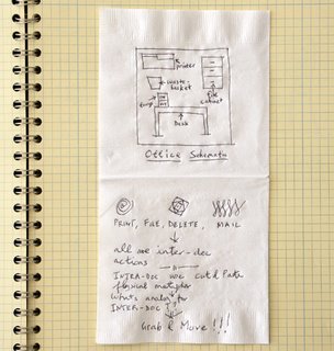
Metaphors have been used successfully in the development of the computer's Graphical User Interface (GUI). A desktop metaphor used to describe common office tasks is sketched on the napkin at the left.

Metaphors are most effective in directing first time users on how to get a computer to perform tasks.

"Metaphors describe one thing in terms of another that enables us to grasp abstract concepts"


Visual metaphors such as the 'trash can' or 'arrow' offer a form of representation whose meanings have become commonly understood. But, designers must be aware of the limits of metaphors and not rely on them as the only means to communicate ideas to users.

The Myth of Metaphor

The Mouse and the Desktop

Tuesday, November 21, 2006

Packaging Design

How a product is presented is just one more design opportunity. Packaging can be clever and functional, separating a well thought through product idea from others by the attention given to this detail.


Design Planning/Strategy

The role of a designer in upper management can provide valuable insight in focusing innovation initatives. As more organizations include design and designers within it's management structures, it improves the chance that the end user will benefit from the type and quality of the products produced.

Kodak Strategy

Nintendo/Sony/Microsoft is one Strategy Better?

Podcast: How Innovation Works-Carol Bilson

Thursday, November 16, 2006

Company: Herman Miller

Herman Miller, the company that created the cubicle and the Aeron chair, has long been admired for its innovation and quality. Herman Miller, Inc., based in Zeeland, Michigan, began in 1923 as a manufacturer of residential furniture. Over the years, the company has become a leader in design and manufacture of modern furniture for both home and office.
That sparkling reputation made it the top furniture maker on Fortune magazine's 2006 ranking of America's Most Admired Companies - a position it's held for 18 of the past 20 years.

Herman Miller Homepage

Herman Miller Consortium

Design's Future: What's Next?

The Industrial age was largely defined by the ability to mass produce items that eased the chores of daily life and expanded our view of the world through multiple forms of transportation. The the internal combustable engine provided the opportunity for the automobile to grow to represent the iconic product of the analog (atoms) age during the 20th century. The car has shaped our lives in enumerable ways, and continues to morph into new forms and into new communities without a hint of fading away.

Likewise, the 21st century, the digital (equations) age has been made possible through the power of the transitor paving the way for a new icon, the computer. Though still in its wide-eyed infancy, is fully poised to mature and frame this age of information technology (IT). Computing technologies are driving global changes and will surely shape lives more profoundly than the automobile. As with personal transportation, IT will impact the way we live by its ability to connect and separate us at the same time. The distinction being one does it physically and the other accomplishes the same ends virtually.

In 1995 Nicholas Negropointe penned a definitive book, "Being Digtal", in which he discussed the changes we could anticipate as Information Technology expanded its reach into society. His book was full of great insight about this new way of being - ditigal. He also pointed to a post-information age in which mass media would get bigger and smaller at the same time thanks to the internet. And so it seems at this moment the ever-present "cell phone" has captured the imaginations of consumers and has become the newest icon for mobility and information sharing.

The questions in the immediate future are around sorting out opportuinities in a media-rich environment where the likes of YouTube and MySpace are satisfying a demand for personal networking. And as we, designers, consider the constant layering of technological innovations and the resulting complexities in developing success products there is a tremendous opportunity for the synthesizing talent of the design professional.

Information technology will continue grow exponentially according to Ray Kurweil, a futurist among other things. So the near future will continue to be on integrating digital products into ever more areas of our lives. But, what comes after is an ability to improve workings of the human body through three-dimensional self organizing molecular structures.

Being Digtal Online

Wired Article Being Digital (1995)

Being Digital Summary

Video: $100 Laptop

Wired Article on Ray Kurweil

Video: Ray Kurweil

Design History: Henry Dreyfuss

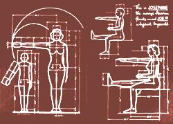
Industrial designer, Henry Dreyfuss, 1904-1972, opened his design office in 1929 to design products for corporate America. That same year, he won a prestigious design competition for creating "the phone of the future," a tabletop version that included transmitter and receiver in the same handset - a revolutionary concept for its time.

Dreyfuss’ legacy was his ability to create user-friendly devises based on and adapted to the human form.

IDSA Biography

Classic Book: Designing for People

Virtual Musuem

Wednesday, November 15, 2006

Clarity in Corporate Identity Programs

Organizations with clear, distinct logos (brands) connect emotionally with consumers by sending a message of confidence, strength and innovation.


A logo (brand) is the organization’s face to the world, and captures its identity for ease of communication, and consistency of message across media and cultures.

A Digital Product: iTunes

"PRODUCTS ARE DEAD" is not a phase product designers want to hear especially when in school studying the subject. Well that was the situation when I first heard that statement uttered by Larry Kelly during a design planning class at the Institute of Design. By the time I finished the program I was fully aware that there was a brave new product world out there. A world in which products base on form alone would offer little incentive as a business proposition. The current reality is that cool forms can be easily copied and reproduced thus potentially out selling the original.

Hence, iTunes, Apples digital music service has provided the competitive advantage that allowed the iPod to capture 70% of the market and provide a key barrier to entry from other digital music players.

Video: Apple introduces the iTunes Music Store.

MLK Memorial Design


By living in Washington DC I have had opportunity to visit many of the memorials that line the Mall. These monuments have sought to capture and communicate the legacy of the past for generations of new audiences. Some memorials succeed at transfering the magnitude of the person or a historical event and others simply don't. The Vietman and the World War II memorials are fitting examples of meeting the challenge and missing it, respectively.

The first memorial honoring Peace broke ground on the Mall, it is my hope that the design will rise to the challenge of communicating the struggle and non-voilent stand of the civil rights movement led by Dr. Martin Luther King Jr. by creating a multi-sensory experience worthy of the lives sacfriced that pushed America closer to its idea.

Build the Dream Organization

Virtual Tour of MLK Memorial

Case Study: The Coffee Pot that didn't Deliver

Identifying a growing market opportunity and having a good concept is not a substitute for understanding the motivations of the consumer.

Several American companies attempted to mimic the success of Phillips Senso, the single serving coffee maker that was a hit in Europe, introducing their products here in 2004. But it seems that poor design execution and miss reading the motivations of the American coffee drinker has several of the producers falling short of their sales forecast.

Chicago Tribune Article

Tuesday, November 14, 2006

Quote: Form Follows Function

Design functionalism sought to eliminate all forms of decoration - the common aesthetic of the 19th century.The resulting clean unadorned forms that begin to appear in the early 20th century represented an emerging design vocabulary that was best expressed in a quote made by the architect Louis Sullivan in 1896. But later altered enough to capture other ideas and the imagination of a generation of designers.

"It is the prevading law of all things organic, and inorganic, of all things physical and metaphysical, of all things human and all things inhuman and all things super-human, of all true manifestations of the head, of the heart, of the soul, that life is recognisable in its expression, that form ever follows function. This is the law." -Louis Sullivan in an essay: Tall Office Building Artistically Considered

More on Sullivan

Preparing Designers for the Future

Design programs in America must take stock of the potential impact of design policy initiatives of nation's intent on participating in the growing international marketplace. China alone has made plans to educate thousands of designers each year to support its developing markets.
What should design programs do to ensure American design students continue to remain competitive? As the numbers of well trained and talented graduates from around the globe continue to increase and seek jobs with U.S. businesses will design education in this country remain relevant?

The following article offers some suggestions on how designers should be prepared for the future.


Enlightened Innovation:
5 Keys to Promoting Thoughtful Design Leadership in Education


A Consultant's Perspective

Fast Company Article - Tough Love

Thursday, November 09, 2006

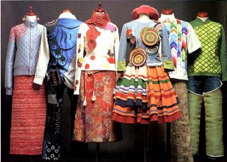
Fashion Design

Where does fashion fit into design history, theory and practice?

This is a question I need to give some consideration to. I tend not to think of fashion design in the same way I think of other design disciplines like: architecture, product, graphic, interaction...

Maybe its because fashion, in general, seems less driven by constraints, but seems more influenced by what people preceive as suitable and are puchasing (the market)and less about the inter-play between the designer's intentions and users needs. Hmm!

Wednesday, November 08, 2006

Design History: Paul Rand (1914-1996)

"Paul Rand's stature as one of the world's leading graphic designers is incontestable. For half a century his pioneering work in the field of advertising design and typography has exerted a profound influence on the design profession; he almost single-handedly transformed "commercial art" from a practice that catered to the lowest common denominator of taste to one that could assert its place among the other fine arts."


Paul Rand: A Designers Art

A Short Interview

Tuesday, November 07, 2006

Technique: Concept (Word) Mapping

Word Mapping is an effective way to kick start and wrap my mind around a new project. Jotting words on a page is one way to document my thinking, tap into prior knowledge and track associations that often lead to new ways of seeing a subject.


"In the 1960s, Joseph D. Novak (1993) at Cornell University began to study the concept mapping technique. His work was based on the theories of David Ausubel (1968), who stressed the importance of prior knowledge in being able to learn about new concepts. Novak concluded that "Meaningful learning involves the assimilation of new concepts and propositions into existing cognitive structures." A concept map is a graphical representation where nodes (points or vertices) represent concepts, and links (arcs or lines) represent the relationships between concepts."

Concept Mapping Defined

Introduction to Concept Mapping

Saturday, November 04, 2006

Design with a Social Impact

The results of a designer's actitivies typically provide solutions for the well-heeled, well-educated and the well-resourced. But when those same talents are applied to situations like homelessness and housing for persons with a chronic illness the results can touch hearts and change lives.


NY Times Article-Architecture

NY Times Article-Interiors

Universal Design

Friday, November 03, 2006

New Product: Beauty, Brains but to little Brawn

On a recent trip to a local retailer the look of the Vtech-I5871 phone set it apart from the mass of other cordless home phones on the shelf. There is little doubt that phones have become a commodity thus most are designed with low cost as a key criterion.

I discovered that beyond its looks the Vtech phone offers some useful features, and some not so useful ones, which set it apart other phones. For starters, the form of the unit gives it an appearance of sophistication and a polished modernism. Its use of cutting edge digital spectrum technology reduces interference and blocks ease dropping. A built-in voice message system, speaker phone and digital phone book (that interfaces with Palm and Outlook software) are fashioned into a single footprint are all winners. Whereas the handset's small color screen that plays animations seems less useful.

For a handheld product, its brushed metal alloy housing will not withstand a single drop without damaging the phone's finish. The metal housing as evidenced by the model on display at the store shows the results of being dropped. All negatives with standing, I comment Vtech for rising above the commodity graveyard and producing brainy and beautiful phone.

Vtech I5871 Phone

Thursday, November 02, 2006

Design History: Charles Rennie Macintosh


I recall being struck by the beauty of Macintosh's chairs during a design history course, particulairly the high back Hill house and the Willow tea room chairs. As a testimony to the lasting style of these chairs, designed a century earlier, they can still be seen in music videos and design magazines.

"Combining a progressive modernity with the spirit of romanticism, the Scottish architect and designer Charles Rennie Mackintosh (1868-1928) created many of the best loved and most influential buildings, furniture and decorative schemes of the early 20th century." -Design Museum-UK

Design Museum

C.R. Macintosh Society

Interior Design is Essential in Creating Custom-Centric Experiences

Experience design is aimed at shaping a customers relationship with a product. Disney is famous for shaping experiences around it's brand; fundamental to that effort is the environment created largely by interior designers.


New York Times Article

Wednesday, November 01, 2006

Framework: Three Overlapping Circles

The product development sweet-spot can be found where business strategy, technological innovation and needs intersect.

Designers should be able to reconcile the concerns of each domain as he/she searches for the most appropriate solution idea. A well balanced solution lends itself to a greater potential for success in the marketplace.

New Products: Sensors come to Sportwear

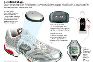
Technology has come to sportswear but the products offered have yet to hit the sweet-spot for consumers. Athletic apparel behemonths like Nike and Addias have partnered with technology companies Polar and Apple to develop products that integrate sensors into their running shoes.

The products offered to date are intriguing to techniophiles and early adopters, but something is still missing from the current offerings that would lead to a market hit (crossing the proverbial tipping point).

The technology is here and companies see opportunity, but what is it that users really value and need that when addressed appropraitely would create a win-win-win?


NY Times Article

NY Times Article